Member-only story
Web Test Automation Workbook #39: Responsive Web Testing
Test a responsive website and verify on different devices
This article is one of the “Web Test Automation Workbook” series, a set of bite-sized exercises. (For more info about this series, check out #1); This is also included in my “How to in Selenium WebDriver” series.
Learning Objectives
- Responsive Testing
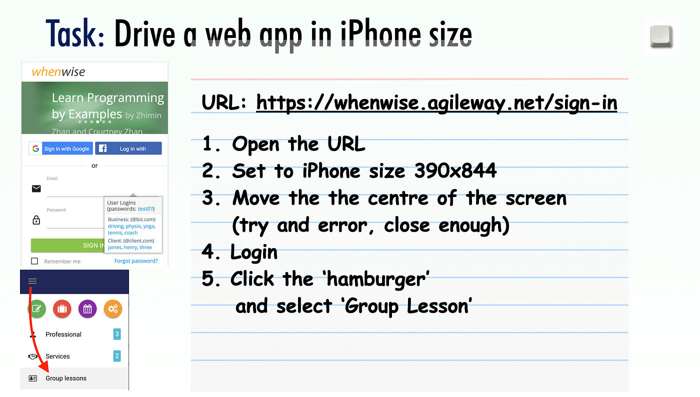
Test Case #39
Test data:
- WhenWise Login Page: https://whenwise.agileway.net/sign-in
- User login details:
yoga@biz.com/test01
Knowledge Point: Responsive Web Design
Nowadays, we visit websites from multiple devices: computers, tablets and smartphones, with different screen sizes. This will require the developers to design a web page that works reasonably well on all platforms.

Responsive Web Design is a technique used to design a web page that ‘intelligently’ fits the platform. In software testing, ‘responsive web testing’ means testing web pages in different browser dimensions (i.e. different devices).
Simulate viewing a web page on different platforms
Inspect a web page in Chrome, then click the icon as indicated below.

The navigation menu is usually hidden on smartphones as a convention. Click the ‘hamburger’ shape to toggle it.
Tasks
Responsive Web Testing in Selenium is easy: you only need to change the browser window’s dimensions.
Resize Browser to iPhone 12 size
driver.manage().window().resize_to(390, 844)The bold text is the browser size (width, height).
